How to design the perfect boardroom
As with all the elements of your office space, the presentation of your boardroom says a lot about your business. For visitors, it is one of the most important spaces and one where impressions, relationships and deals will be made.
From interviews to client meetings, a boardroom should reflect your brand’s ethos while also promoting an air of professionalism.
We’ve previously blogged about the benefits of creating an environment which promotes happiness, wellbeing and productivity and the same goes for the boardroom. Meetings can be long, so it’s important to do it in a space in which everyone feels comfortable.

Space and layout
A well-designed and thought-out space, regardless of its size, sparks an immediate statement and, just like the rest of your office space, can speak volumes about your company ethos.
It’s important, therefore, to consider the layout of the room and work with the space you have. We all know that first impressions count and the appearance of your boardroom will have a big impact on how people view both you and your business as a whole.
A cluttered, messy space does little to encourage productivity and creative thinking, giving the impression that your business culture is as haphazard as the space people are sitting in.

All lit up
Choosing the right lighting is important. Not only does bad lighting do little to fuel the imagination, it can also have a huge impact on people’s wellbeing. No-one wants to be sat in a dark room for an extended period of time with a headache.
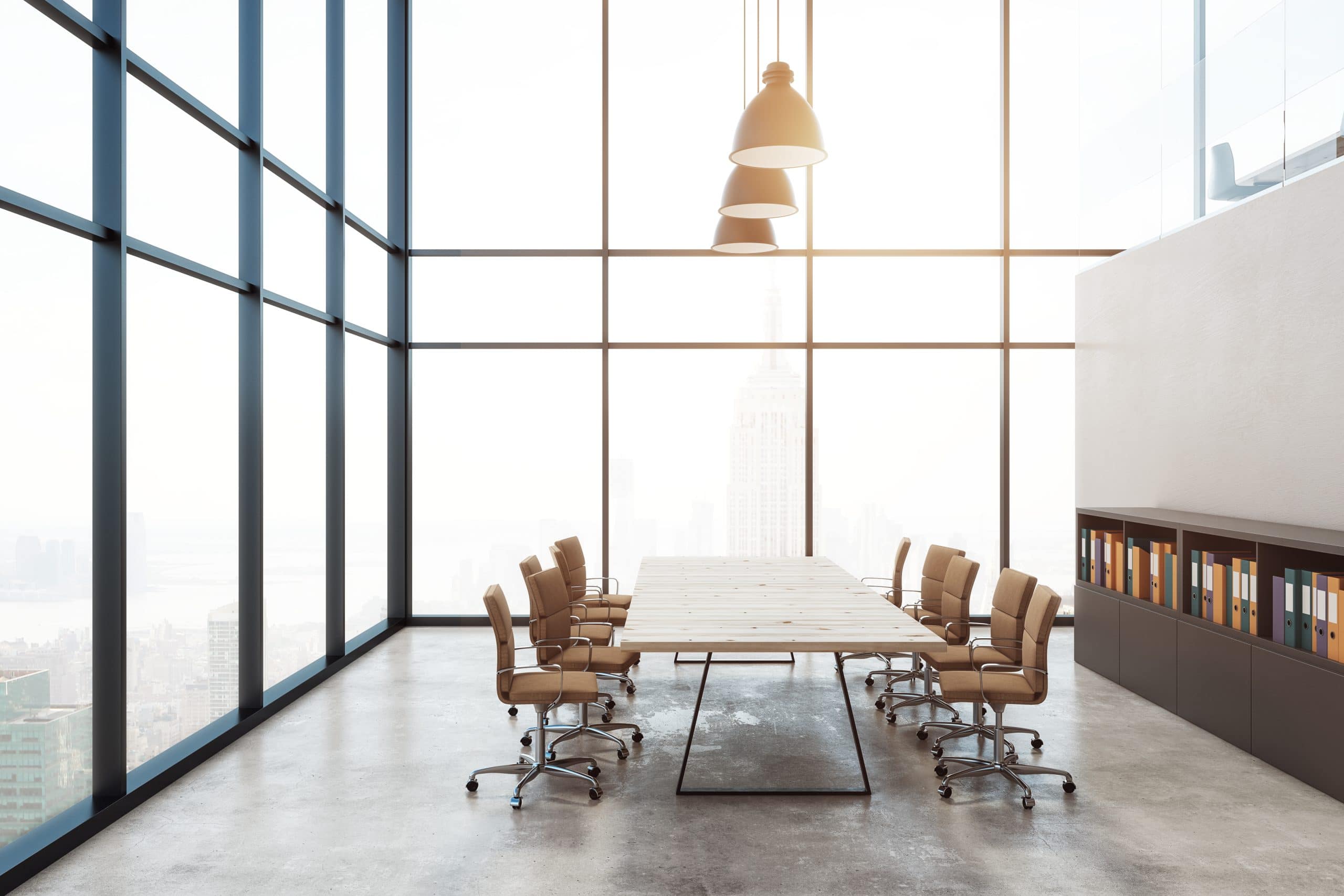
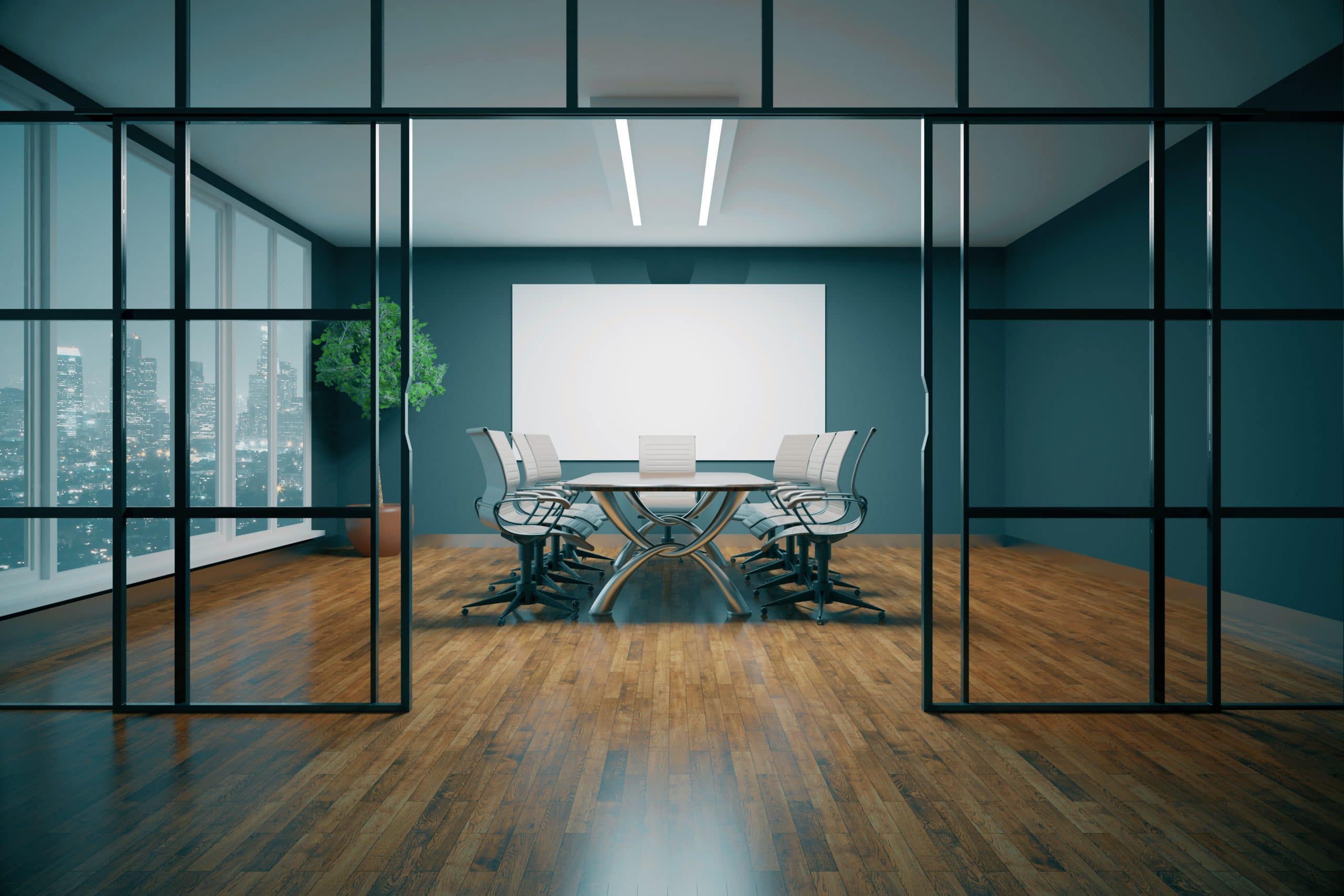
If it’s possible to install, glass partitioning allows light to filter in from the rest of the office. Frosting and other textures can be added to the glass to ensure privacy.
There are also now plenty of lighting options on the market that can mimic daylight, such as LED daylight bulbs, providing a lighter, airier space. There are also plenty of statement lighting pieces available, so as well as their practical uses, they can also be used to add a real ‘wow’ factor and inject some of your personality into the space.

Sparking a statement
As we know, a first impression is lasting, so creating an aesthetically pleasing space can have a big impact. As with the rest of your office space, your boardroom should similarly reflect your brand – there’s no one size fits all.
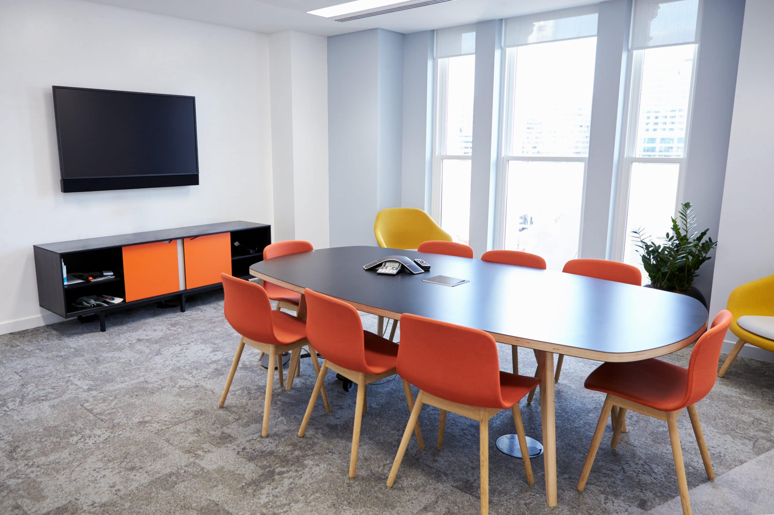
Injecting the space with your brand colours is an effective way to reflect your company’s personality, but consider the overall impact. While well thought-out flashes of colour can provide a statement, too much – especially if a bold colour – could prove distracting. Rather than painting an entire wall a statement colour, consider introducing colour through ornaments and accessories. These can also be adapted and updated with the times to keep the space looking fresh and inspiring.

Practically perfect
While it’s easy to get carried away with the design elements, a boardroom also has to be practical – after all, it is a space designed for group work and discussion, so ensure that everything that needs to be in there, is there.
Think about storage options which can accommodate everything that needs to be kept in the room, while ensuring it’s neither messy nor cluttered. If cupboards and shelving units are not practical for the size or layout of the room, consider wall and ceiling space and how these can be utilised to facilitate certain tools like projectors and boards, adding an air of professionalism. Once people are settled in the room, you don’t want them to have to leave it.

The boardroom is one of the most important rooms in any office for many businesses and organisations. While it may not necessarily be used on a daily basis by staff members, it’s as important to consider the image it presents to clients and potential employees as the rest of the office space. So, it’s certainly a space worth investing in.

