Top 5 complementary interior design combinations
When the time comes to renovate your space, whether personal or corporate, it’s incredibly important to spend ample time planning for the aesthetic and functional aspects of the design. It’s worth having a basic knowledge of the colours, materials and textures that complement each other so that you can create a timeless design that really works to accentuate the space.
Complementary colour scheme & neutrals
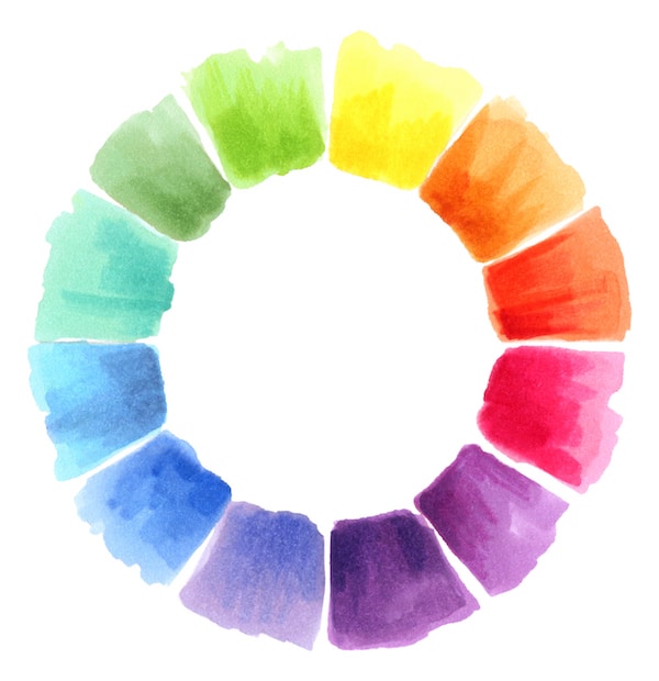
Taking some time to look at a colour wheel is one of the easiest ways to discover complementary colours. The general rule of thumb is that opposite colours tend to enhance each other – so, for example, shades of yellow are thought to accentuate purple hues, similarly to blue and orange. Those who are new to interior design, however, are often advised to go for split-complementary colours, as these are a little less striking. In which case, it’s best to go for a bold colour as your main shade, such as red, and then use the two colours on either side of the opposite colour – such as turquoise and light green shades. These are easier to work with and less overwhelming to the space.
Those who do opt for a combination of opposite colours would benefit from adding some neutral shades into the design. In an otherwise highly vibrant environment, softer colours give the eye a much needed break.
Small space & reflective materials
Small spaces, whether that’s a room in the home or an office, need a little extra consideration. The design aim should be to try and maximise the space, making it appear larger. One of the easiest ways to do this is by incorporating reflective materials to mirror the incoming light. In fabric, this can include silk or satin; alternatively, glossy surfaces and metallic elements can also serve well to reflect natural and artificial lighting.
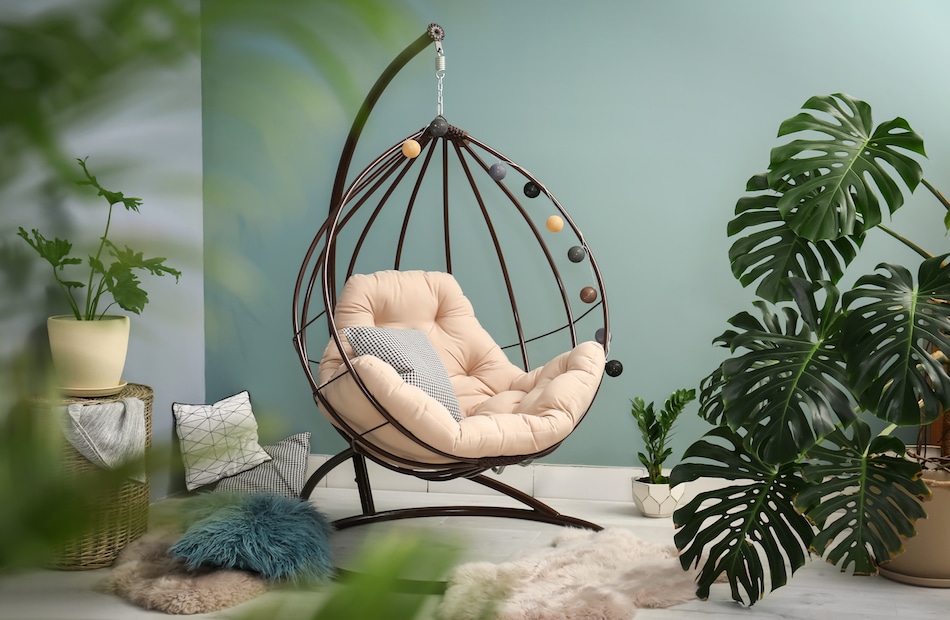
Natural/rough textures & cool-toned colours
Rough textures not only add tactile interest to a space, but they also work to create a comfortable, inviting atmosphere. In a space that utilises cool-toned colours, such as blue and green, textures can add some much-needed warmth for a balance of temperatures. Textures inspired by wood and foliage are also great for incorporating biophilic elements into the design.
Stone, exposed walls and frosted glass can all work well to add a point of interest, as can matte finishes on metal or paint.
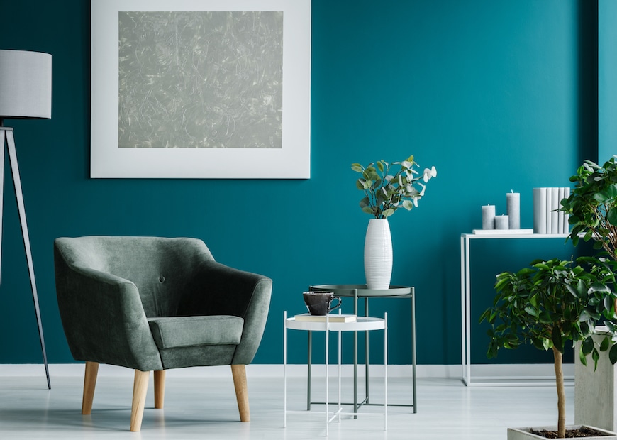
Analogous shades & patterns
Categorised as adjacent segments on the colour wheel, analogous shades are very commonly spotted amongst nature. Hues of two or three similar colours are placed together to create unfailing complementary, tranquil designs. However, when using analogous colours – such as shades of red, orange and yellow or blue and green, make sure to divide them carefully. One colour needs to dominate, with the second colour supporting the first. The third colour then acts as an accent shade.
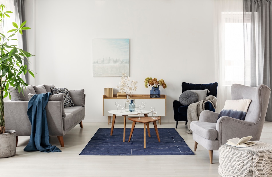
Neutral colour schemes & various textures
Minimalist designs have really come to the fore in recent years, with many opting for neutral colour palettes. Whilst this undoubtedly adds an element of simplicity and makes a room appear brighter, it can lack dimension when these are used alone. That’s why it’s important to pair neutral shades with a variety of textures, since this adds an area of interest. Try incorporating biophilic elements – such as foliage, wood and stone, and pair these with glossy surfaces and matte metal finishes.

Although it’s possible for everyone to learn the basics of complementary design, it can be hard to know exactly how to incorporate them into your space to strike the right balance. If you’re unsure how to apply these to your space, don’t hesitate to contact a member of our team.